Single Image Proves Human-Caused Global Warming

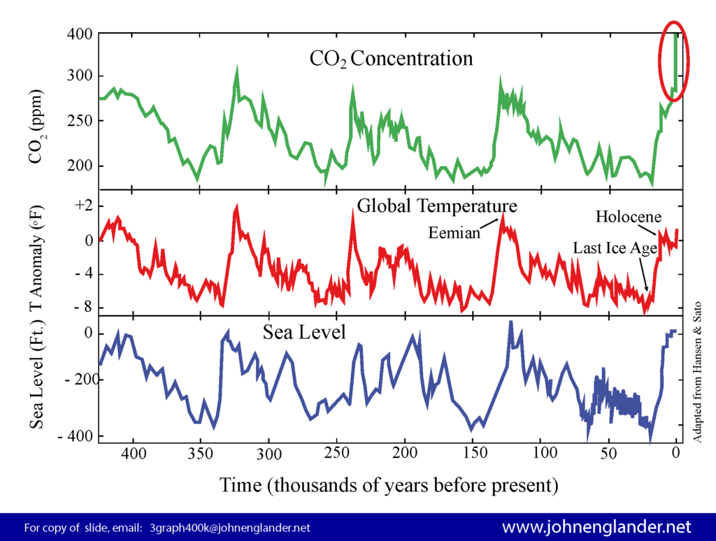
Global Sea Level Temperature and CO2 move together over the long term. Four “ice age cycles” are shown here. Earth has now entered a new climate era. Chart may be used freely under Creative Commons with Attribution. Available in US and Metric units.
I offer this graphic as one of the simplest ways to communicate two things. 1) that current “global warming” was triggered by humans, and 2) that sea level is going to rise for a LONG time. Even though some people may avoid looking at any graph, this one is easily explained and quite compelling, bringing together climate change, sea level, and greenhouse gases — which all move together over long periods of time. In my presentations and briefings to the general public and to experts, I show this with an explanation that goes something like this:
Everyone has heard of the “ice ages”, the periods of time, when ice sheets several miles thick covered most of the northern hemisphere. Today, only Greenland and Antarctica have ice sheets that thick, but just twenty thousand years ago, most of North America, Europe and Asia were covered by ice several miles (kilometers) thick. We have considerable written and cultural records going back ten thousand years, so the last ice age is really not that distant in terms of geologic history.
Looking at the chart above, the red line, shows global average temperature. What we think of as the “ice ages” are when the line is at the low point of the up-down pattern, with the most recent one marked at 20,000 years ago. (Proper definition of ‘ice ages’ in Note at bottom.) We are now at the “warm point” in the normal cycle. Such ice age cycles have been happening naturally, for several million years on a regular pattern of about one hundred thousand years. This chart illustrates four full ice age cycles, though the pattern has been occurring for several million years.
That natural pattern of the Ice Ages is caused by a combination of three planetary changes, the shape of Earth’s elliptical orbit around the sun, the tilt, and the “wobble.” Each vary with different periods, but align for maximum effect between ninety five and one hundred twenty five thousand years – a phenomenon called the Milankovitch Cycles.
As the planet warms for thousands of years, the ice sheets get smaller and sea level rises. Back to the chart, note that the blue line at the bottom represents sea level. Global average sea level follows global temperature almost exactly, just as we would expect. As the planet gets warmer, ice melts and sea level rises. The reverse is true as well, during cooling climate eras, the ice sheets get larger and sea level goes down.
As you can see, with each ice age cycle, sea level rises and falls an incredible 300 to 400 feet vertically (roughly 100 meters). That’s the height of a thirty floor building. The reason that sea level had not changed much for the last few thousand years can be gleaned from this chart. We were at the turning point. After roughly twenty thousand years of sea level rising, by the natural pattern, we should have been changing direction, heading into the eighty thousand year phase of sea level falling, as the Earth cooled, heading towards the next ice age, locking lots of water into the frozen form. Instead all three lines are now heading higher as we will understand shortly.
Now look at the green top line, carbon dioxide, or CO2, one of the dominant greenhouse gases (GHG for short). We see that it also moves in synchronization with the global average temperature and sea level. The green and red lines move together due to a connection that is a little less obvious than ice melting. Back in 1859, John Tyndall demonstrated that carbon dioxide had a dramatic effect to warm the atmosphere. As I pointed out a few weeks ago in a post, Alexander Graham Bell, one of the most famous inventors and scientists ever, described the “Greenhouse Effect” in 1917, expressing concern about the effect of burning fossil fuels that would warm our atmosphere, recommending that we develop solar technology — a century ago!!
In the natural cycles of the last few million years, the changing temperature of our climate due to the Milankovitch Cycles, caused the CO2 levels to change as the gas was liberated from or absorbed by the ocean according to a simple principle of physics. So temperature normally drove (forced) the change in CO2 levels. As you can see in the red circle at the upper right of the chart, the green line for carbon dioxide has now shot straight upward, crossing the 400 ppm level, some 40% higher than at any time in the last ten million years.
Because of the “greenhouse effect” cited just above, the physical and chemical properties of that molecule have caused our atmosphere and oceans to warm globally by more than one and a half degrees Fahrenheit (almost one degree Celsius) — a very significant amount when compared to the change since the last ice age. This upward spike, often referred to as global warming, correlates very well with the emissions from burning fossil fuels over the last century or two. It’s a sharp departure from the natural range of the last few million years, even including the ice age cycles, and is thus rather good evidence that the current warming is human caused — departing from the natural climate changes.
Each of the three parameters have normal upper and lower limits for these past several million years. In addition to the sea level limits of 300 – 400 feet (90 – 120 meters), the historical bounds for CO2 are approximately 180 – 280 PPM (parts per million), and global average temperature over the ice ages warms and cools roughly 9 degrees Fahrenheit (5 degrees Celsius). We are generally at the warm point of the typical cycle. Also it is important to note that the roughly hundred thousand year cycles, splits into about an 80 / 20 split, with the longer portion being the cooling, the growth of ice, and falling sea level.

While there is a lag time or relatively slow response to the skyrocketing level of greenhouse gases, temperatures are rising and sea level is rising and accelerating as the ice on land at both poles melts faster and faster. Back to the chart, if we look back to the last warm point, sea level reached a height about 25 feet (7+ meters) higher than present. Given our speed of warming and melting, we will most likely see even higher sea levels in the coming centuries.
Thus my simple conclusion that we must do two things simultaneously and AS SOON AS POSSIBLE: 1) Work to reduce the greenhouse gases and the warming, and 2) Begin preparing for higher sea level. With the latest government projections of up to eight feet of sea level rise this century, we have no time to waste.
Spread the word. Please use this graphic if you find it helpful.
To Download copies of the graphic, with use allowed per Creative Commons with Attribution:
420,000 year Englander Triple Chart rev2017 US Units
420,000 year Englander triple chart rev2017 METRIC
* Note re “Ice Age”: Technically, to geologists and other scientists, we are still in an “ice age” since the Earth still has significant ice. In that context what we commonly consider the ice age, was the “last glacial maximum.” Because my writing aims to speak to a wide audience in familiar language, I follow the common usage here, referring to the “ice age” as the period with much more ice than today, with the peak some twenty thousand years ago.
