
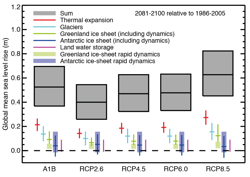
 There is a graph in the latest IPCC Report, AR5, that shows a stunning picture of how much they may be understating sea level rise projections this century. (For reference it is Figure 13-10, on page 1180.)
Frankly it is done in a format that is a challenge for non scientists to decipher and even many scientists skate past it, not quite grasping what it shows — or in fact, does not show. Below I have taken the source data, from Table 13-5 (page 1182) and reformatted it as a more traditional stacked bar graph.
There are 4 different scenarios which is how the IPCC looks at the range of what they see as possible this century, with increased warming from left to right. If you are not familiar, the “IPCC” is the Intergovernmental Panel on Climate Change, organized by the United Nations to be the definitive work about climate. They issue new major reports every five or six years. The latest known by the shorthand “AR5” for Assessment Report 5, came out in several volumes in 2013.
Looking at the light blue lines for Antarctica shows something quite surprising. The amount of ice contribution from Antarctica does not change over the first three projections. In the fourth and warmest scenario, it become LESS. This is counterintuitive in terms of a warmer planet.
The reason for the decrease in the highest scenario is that a warmer ocean will evaporate more. The excess moisture will come down as abnormal rainfall or snow, if it is in a cold air zone — something which happens around East Antarctica. Indeed East Antarctica has been getting thick and accumulating more sea ice. Thus in a warming world the models show East Antarctica holding more snow / ice, technically reducing sea level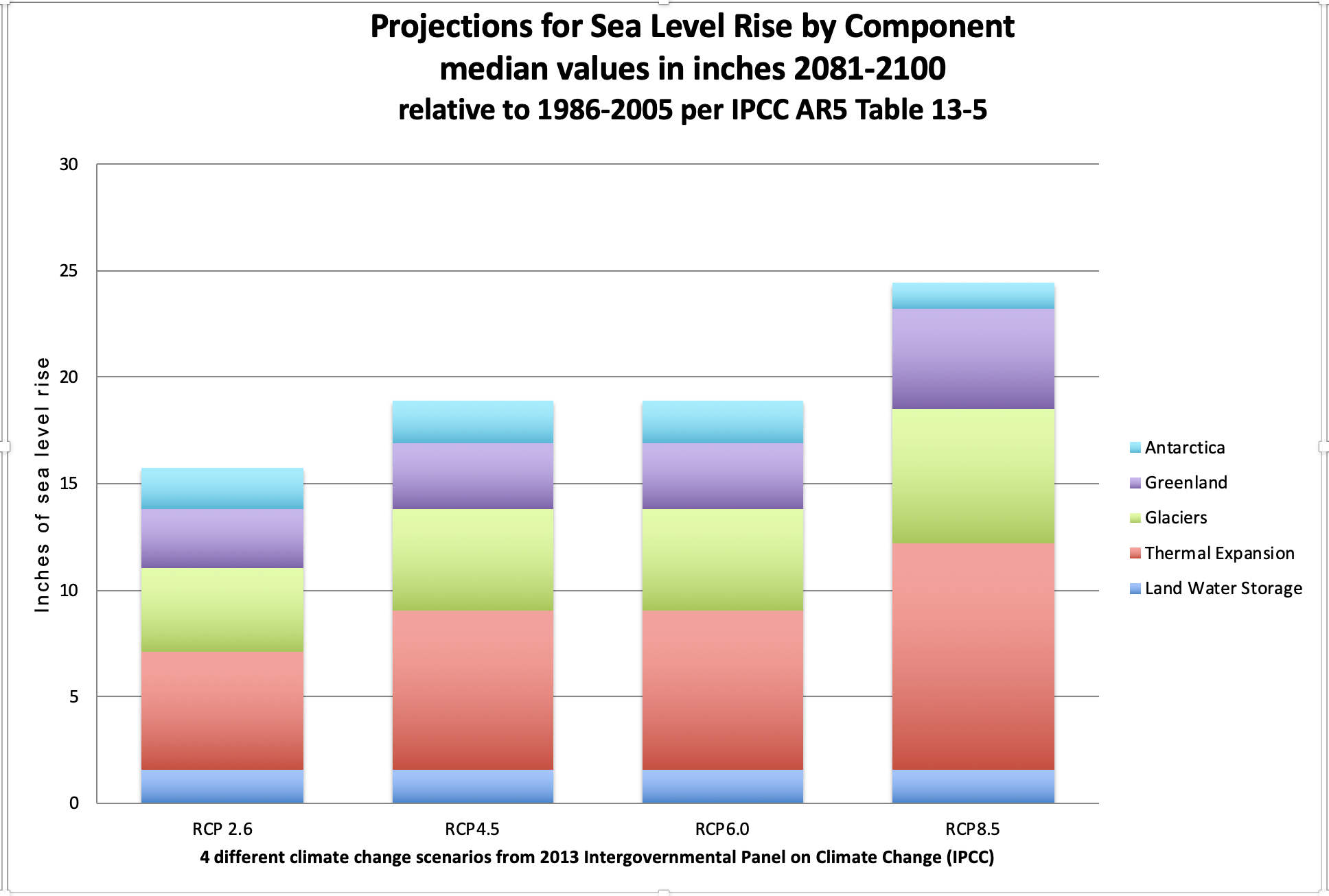
The problem is West Antarctica. It is generally much less stable. There is a very good 7 minute piece on Youtube “Meltwater Pulse 2B” that explains just how serious a problem it could be. But as that video describes, there is no way to quantify how much of those Pine Island Glaciers will likely melt and slide into the sea by the year 2100, raising sea level.
As a result that component is left out of the IPCC tabulations. Their protocols require that the numbers presented be quantifiable, with a high degree of certainty. Just the six Pine Island marine glaciers (resting underwater, not on land) potentially represent about 10 feet of sea level rise.
Looking at that Youtube video and the lack of any increase of West Antarctic contribution to sea level even in the extreme warming scenario provides a rather visual picture of why the SLR projections of the IPCC are very likely understated.