
Exposing the lie that “Global Warming Is Over”
 There is some confusion about the rate of global warming that should be set straight. Increasingly a message is being heard that “global warming is slowing down” or even that it is coming to an end.
Some who talk about this probably do so out of honest confusion, for some it may be wishful thinking, but for a certain group it is part of the intentional disinformation perhaps better known as propaganda. It is time to clarify for some, and expose the lie for others.
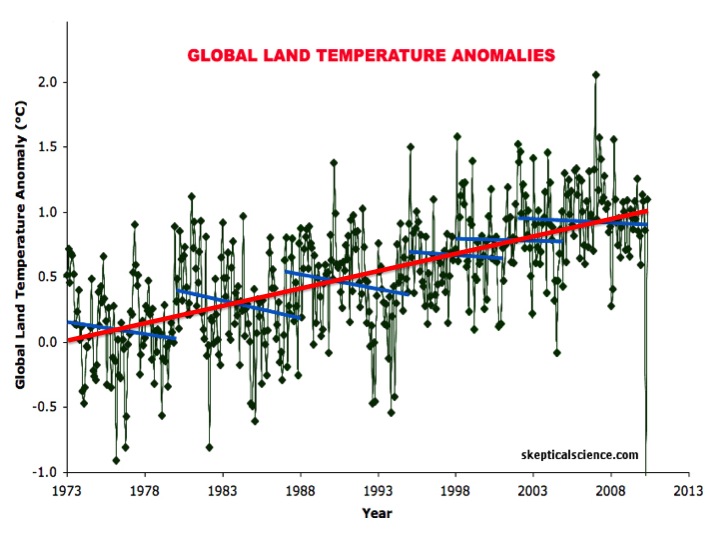
This temperature chart of global land temperature anomalies (variations from the normal) tells the story quite clearly. It covers almost four decades, a good representative sample.
The claims about the slowdown in warming, even suggesting that the warming has ended, choose a selection of years that fits the story they want to tell, often looking at a recent seven year or seventeen year pattern to show a flat line, or even decline. In fact there are six blue lines on this chart, highlighting brief select sets of years, that can each be used to show a flat or even slight cooling period.
But when we step back to look at a larger sample, without prejudice for the story we want to tell, an entirely different picture emerges. The red line is the statistically valid line through all the dots. It puts the lie to the various “steps” along the ever increasing line. This is why I always look at minimums of a decade and prefer round units of time, e.g. centuries, thousands, tens of thousands, etc. It eliminates the issue of “cherry picking” the sample you want to present the picture you want to portray. It is the honest way to look at data.
At this point most people realize that specific weather patterns in a region may vary from an objective measure of how the Earth’s climate is changing by the decades. In other words there are a lot of weather variables, both by locations and by years. Like most complicated situations, the economy being one example, we need some objective statistically valid way to compare change over time. We do that with global average temperature and over the last several decades that measure has been going ever-upward, though not necessarily in a straight line from year to year.
Why would temperatures move in such a stepwise manner?
Of course the logical question is why would the global temperature move in such a jumpy way. While it is too early to say definitively, the evidence is getting pretty clear and the answer is in the oceans. The sea has enormous heat capacity. It takes a lot longer to heat water than it does air, but the water retains the heat longer too — an effect I describe in my book High Tide On Main Street as the “swimming pool effect” (page 78).
 The oceans have currents and layers of different temperature water that do not easily bridge from one to the other. You may have experienced such thermoclines swimming in the ocean or in a lake.
The extra heat that has been trapped by the greenhouse gases has mostly been warming the upper layers of the ocean. With the deepest parts of the ocean reaching almost seven miles — some 36,000 feet, it takes centuries for warmer temperatures in the upper regions to transfer down to the deeper layers. The average ocean depth is approximately twelve thousand feet, more than two miles (3 km). As heat transfers to different layers it redistributes heat from the upper regions, appearing to have a cooling effect.
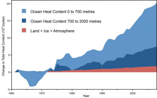
The graph at the left (Nuccitelli et al) gives a good indication of where the heat is going — deeper and deeper into the ocean. The ocean acts like a heat sump, but with layers. It is hard to measure these minute changes in temperature in the deep ocean with scientific certainty, but it is a project to which more resources are now being deployed, realizing that it is an important part of understanding how the Earth’s temperature systems adjust in short time intervals such as a a decade.
Here is a metaphor that may help. Imagine a house with two floors above ground, heated by a typical furnace of some type. If we added insulation to the roof — like the greenhouse gases in our atmosphere — less heat would be lost through the roof, and the house would begin to heat up if we keep the furnace at the same output (like our sun). Now add the fact that our imaginary house metaphor has three layers of unheated basement, each separated by a closed thin door, providing a slight heat barrier. Each layer of basement would change temperature much more slowly than the residence floors above.
But as the heat in the house increased, slowly but surely the first basement would see a slight temperature increase. And when it increases past a certain point, some heat would transfer to the next deeper basement, and so on. That appears to be what is happening to Earth’s temperature. It is almost exactly the picture of temperature increase shown in the top graph and is very consistent with known models of ocean heat layers.
If you want to look at a fantasy picture of global warming being over, you should continue to look at the blue lines in the top graph. If you want an image depicting a larger unbiased sample, the essence of scientific sampling, look at the larger sample set, the red line.
If you find this useful, please share and consider signing up for my infrequent e-mail messages.