
Best Image to Illustrate Climate Problem – in case you missed it
There are at least hundreds of facts, images, and perspectives that help people to believe that climate change is happening, and that humans are impacting it, and that the trend is ominous. Or, NOT.
A recent poll showed that a little more than 50% of the population believes that climate change is real; that humans are making it worse; and that it warrants action. But roughly 20% dispute that same conclusion, citing some fact, image, or apparent contradiction. (It is worth noting that Republican Presidential candidate Mitt Romney agreed that humans were affecting climate and that we needed to address the problem, within the last month, causing Rush Limbaugh to immediately declare his candidacy as being finished. Yet Romney still leads the pack.)
The point is that there are LOTS of images and facts about climate change, a/k/a global warming. Some of them seem to contradict others. In previous blog posts, I have addressed some of the confusing facts. For example the record snowfall in the US and Europe last winter has caused many to erroneously believe that the world is cooling. Not true, as I explained.
So with all the confusion, including a few eminently qualified or credentialed scientists, questioning the CO2 – temperature relationship, what is the intelligent questioning observer to do?
Or perhaps more to your interest, what is the fact or image that might be so clear or singular that it helps people to see through the endless facts put forth by both sides. I.e. what is the BEST graphic to make the case? Many experts will suggest different images. I want to share with you the one that does it for me, and that I show even to those who are concerned, because it is so powerful, clean, and unambiguous.
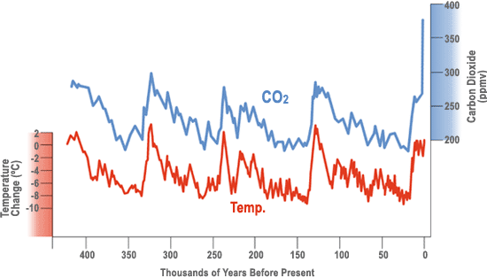
This is the reconstruction of CO2 and temperature from the bubbles trapped in the ice sheets of Greenland and Antarctica. To my knowledge, even those who question the factor of mankind’s greenhouse contribution — primarily carbon dioxide from burning fossil fuel — do not question the essential numbers in these two graphs which go back about 420 thousand years.
There are 3 key facts to take from this image:
- Over 400 thousand years temperature and CO2 have moved almost in lockstep parallel.
- In very recent times — the last century or so — CO2 has shot up like a rocket, leaving the hanging question of how quickly temperature might follow?
- Close inspection reveals that sometimes temperature changes precede CO2, and sometimes it is the other. In other words it appears that one can follow the other.
The last point is the one that is often used to question or discredit the synchronous relationship between the two measurements. Yet the scientific explanation is quite simple. It was demonstrated in the mid 1800’s that CO2 has amazing powers to trap heat in the atmosphere, acting like the glass in a greenhouse. Thus it is easy to see how higher levels of CO2 can cause temperature to rise, just like a greenhouse for plants in a colder environment. But what about the other direction?
Gases dissolve in liquids. That explains everything from how fish breathe the oxygen out of the water, to how bubbles form in soda when you remove the cap, reducing the surface pressure, that holds the gas (carbon dioxide) in solution. When the cap is removed, less gas can stay dissolved, so it bubbles up.
Besides the pressure forcing gas into a liquid, it is easily demonstrated that warmer liquids can hold less gas. That is why, as the ocean warms, it releases carbon dioxide and other gases to the atmosphere. It is the carbon dioxide that has the big effect on making the atmosphere warmer.
There you have the explanation: CO2 is a powerful greenhouse gas that warms air temperature and ocean temperature. If ocean temperature warms, it releases CO2 to the atmosphere.
The pair work together in the opposite direction as well. If CO2 is removed from the atmosphere over hundreds of thousands, or millions of years, by plants or weathering of rocks, temperatures will cool. If temperatures cool, more gases, including CO2 dissolves in the ocean, reducing atmospheric CO2.
If someone disputes human caused global average temperature increase, show them the above graph. Ask if they are aware of anyone that disputes the two lines? If not, how can you avoid the conclusion that over the long term, that global temperature, will move significantly higher, in the direction of CO2, to maintain a semblance of the 420,000 year synchronous movement?
We can measure the CO2 from the burning of coal and other fossil fuel in greater quantity. It is now at 394 ppm, compared to a normal range of approximately 180-280 for the last few million years, the same as shown on the blue line of the graph. Warming temperature means changes for snow pack, ice sheets, water supply, sea level, agriculture, and so on.
I think it’s a compelling case; the classic “picture that’s worth a thousand words.” Hope you do too.